.png)
Redesign,
App
UX/UI
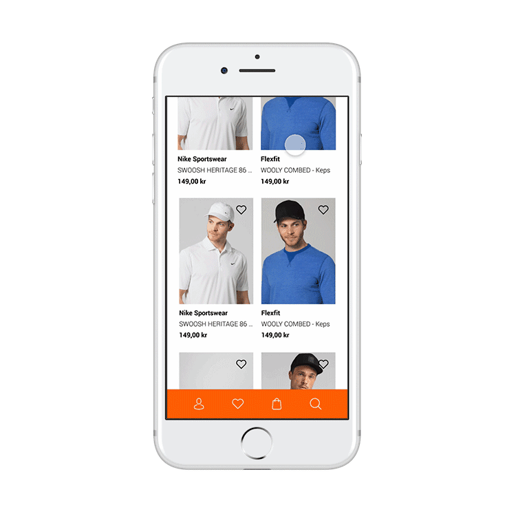
I was tasked to redesign an app of my choice. With my small hands and my love for lying on the couch, I chose Zalando due to the fact that I found it being very unavailable, especially for one-handed usage. Shopping or checking out news in the app should be available for the users even when commuting, waiting, or as aforementioned, for small-handed people lying down in the couch. (Nothing personal...)
I based my redesign on existing research& sources, and conducted user research to iterate. I categorized the availability of the UI based on S.Hoober's research on reachability, and focused on positioning the most used features in the green zones. I focused on the UI to be easy to read and navigate through, with layers (also known as cards) as is often seen in modern apps today.
I followed the brands graphic profile and presented a navigation bar that clearly indicates where the user is and can go next. Tending to the users feedback, the products are now easy to see in detail, the filter is easy to understand, and back out from for both left and right-handed users.